Positive energy: the effect of colours in the office or home office
Colours play a major role because, in addition to their aesthetic effect, they also exert an influence on the human psyche. Colours can cause or intensify feelings of warmth, cold, excitement or relaxation. Moreover, colour is a statement - a hip advertising agency will opt for a different colour concept than a traditional family business with conservative clients. The colour theory of Bauhaus master Johannes Itten, who classified and named colours according to the seasons, has taken hold. The types of spring, summer, autumn and winter are better known in the field of fashion and cosmetics, but their application is just as valid for furnishing offices and homes.
Bauhaus colours
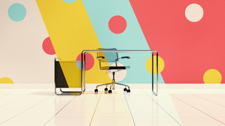
Itten also developed the typical clear Bauhaus colours used today by the USM company: White, three shades of grey, silver, black, two shades of blue, yellow, green, orange, red, beige and brown. The Bauhaus master found that people intuitively reach for the colour that suits them best. Mind-oriented melancholics prefer cool blue, phlegmatics balancing green, sanguine people cheerful yellow and temperamental cholerics red - so they say. As a general rule, the more striking the colour, the smaller the area should be. A splash of colour has a stimulating effect, a large area or many colours have a restless effect.
Well-combined colour - from calming to exciting
If you combine USM furniture, for example, you can be sure that the respective colours are identical due to standardisation. If you are unsure what matches, choosing the identical colour can be an option, tone in tone is the motto. This also works if you combine different brightness levels of a colour. Different colours of the same brightness level can also look appealing. Another possibility for a good combination are the so-called complementary colours: Yellow with violet, red with green and blue with orange. The interesting thing about complementary colours is that these combinations, when mixed together, each produce grey.
More effect with complementary colours
When placed next to each other, complementary colours intensify the respective luminosity and thus the effect. A shelf or sofa comes into its own better with the complementary colour on the wall or with a corresponding carpet. If you come across unpleasant doors and frames in grey or beige, this sight can be softened with complementary colours. This also applies to stone, wood or metal. Complementary colours should be matched to each other in proportion to develop an optimal effect; exclusively purple and green should be 1:1, yellow to violet 1:3, blue to orange 2:1. Pure complementary colours may appear garish; a combination of nuances brings more calm.
The theory of the seasons: How colours work
Colours have a physical wavelength, but are perceived individually. The theory of the seasons states that the colours of a season always match and harmonise with each other, with one basic colour dominating: Yellow belongs to spring, blue to summer and winter, red to autumn. Red and yellow are perceived by humans as more warm than the so-called cool blue, which is why we speak of "warm" or "cool" colours. To a certain extent, the subtle natural nuances can be produced artificially. Colours have an effect on the soul and can enhance moods. While spring stands out with its cheerful blaze of colour, summer scores with glistening light (pastel colours). Autumn delights with the earthy and heavy colours of nature and the palette of colourful foliage. Winter loves black and white and especially strong colours.
It's the nuance that counts...
Every colour is present in every season, but has a characteristic look. Everything is allowed if the nuance is right. Combinations of winter and autumn or spring and summer result in tension through disharmony. For a positive working atmosphere full of energy, winter with its neutral businesslike mood, summer with stimulating colours for creative professions and autumn and spring for a friendly and performance-promoting climate are suitable, depending on the business. When choosing colours, the existing lighting conditions should also be taken into account; dull colours can appear even sadder due to dull light. Dark colours make rooms look smaller, light colours emphasise spaciousness. Dark ceilings make a room look lower.
Colours in the office or in the home
The seasonal theory even takes into account nature's textures, rough, rounded or smooth. When sunny spring colours from nature are transferred into rooms, yellowish metal or wood fits perfectly. Silver-coloured metal and dark wood go well with summer. Warm autumn colours can be combined well with animal print or gold-coloured accessories. The bright winter colours are best accentuated by geometric shapes and cool metal - this inevitably brings to mind the cantilever chairs of the traditional Thonet company by Marcel Breuer, the Knoll Barcelona Chair by Ludwig Mies van der Rohe and the Knoll Diamond Chair by Harry Bertoia or the Vitra Wire Chair DKR by Charles & Ray Eames. These classic chairs and many more are available in your pro office shop.
New or extension?
When you move in for the first time, you can choose between the four basic colour moods. If you are taking over a furnished office or extending your flat into a home office, you can use the previous seasonal mood as a guide. If no colour concept is apparent, the overall mood of the rooms is a good guide.
The effect of light on colours
Daylit rooms make colours appear intense. In rooms with evening light, the colour appears softer. Rooms with windows facing north have no direct light incidence. The use of artificial lighting should always be based on the natural incidence of light in order to show the colour to its best advantage. Lighting should be planned to be as direct and indirect as possible and to provide the right colour temperature to make your colours glow in the office or home. You will find many beautiful luminaires from renowned designers in your pro office shop.

